Show and Tell
Mahreen Fatima can show you how to play a game.
You wake up, hop out of bed, and face a timer counting down on the wall. Cold cameras stare at you as you bump into the walls of the glass box you awoke in. A small, unintrusive rectangle appears on the right side of your screen to tell you how to move and jump. You notice that there’s a room beyond this that features a large, inviting red button. The timer seems to tick down faster. At zero, a hole bursts open.
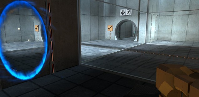
Portal demonstrates its main mechanic within the first minute of gameplay. Through the level design, the game primes the player to understand how to play the moment they leave the starting area. The small glass bedroom and the cameras on the wall make the player feel like they’re being watched, pushing them to find an escape. After quickly exhausting the few opportunities for interaction they’re provided in the small starting space, the appearance of a portal, a colorful change in the cold, grey wall, begs to be walked through. The portal allows the player a rare opportunity to see their character leave the room they were just in to understand how portals work.
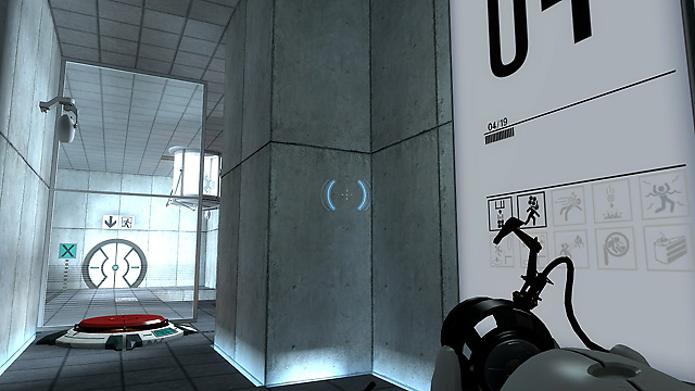 These early tutorials and explanations (or the lack thereof) create the foundation of a player’s game experience. Controlling the amount of information the player receives influences how they understand the experience they are about to have. With this in mind, a game can predict and plan for the player’s thoughts and reactions. Tutorializing this way also establishes the level of preparation a player has.
Information is a commodity. Knowing your opponent’s hand, what’s inside that next room, or what happens when you step through a hole in the wall changes the way the player approaches a problem. Providing the player with more information pushes them to make more educated decisions, solving more complex problems with the confidence of having the necessary tools and knowledge at their disposal. On the other hand, however, games can limit and ration information, tailoring the player’s experience and progression to their liking.
As the game continues, Portal sticks to its methodology of tutorializing through level design. Tools and techniques are carefully integrated and shown to the player to build their knowledge base. By constantly testing the player in increasingly complex and involved puzzles, the game ensures that the player always has the necessary skill set before moving on to the next room. Integrating the tutorial into gameplay allows the game to seamlessly introduce mechanics to a player without giving an overwhelming amount of information at once or oversaturating the experience with gameplay-lacking moments. Excessive handholding can leave the player feeling like it’s taking too long to get to the actual gameplay. Through application, the lessons of the tutorial are ingrained, making gameplay an important learning experience.
 However, these examples don’t necessarily mean that lacking a tutorial altogether makes for a better game experience. A simplistic game can benefit from a minimalistic tutorial as well as provide the player with more opportunities for interaction and play. Games with only a few mechanics in a small system, such as puzzle games like Hexcells or Kami, do not need complex tutorials. Only teaching the player a few tricks and mechanics can be enough for the player to experiment and create their own strategies and techniques. But on the other hand, inserting a user into a complex experience with no preparation can lead to too steep of a learning curve, potentially driving players away.
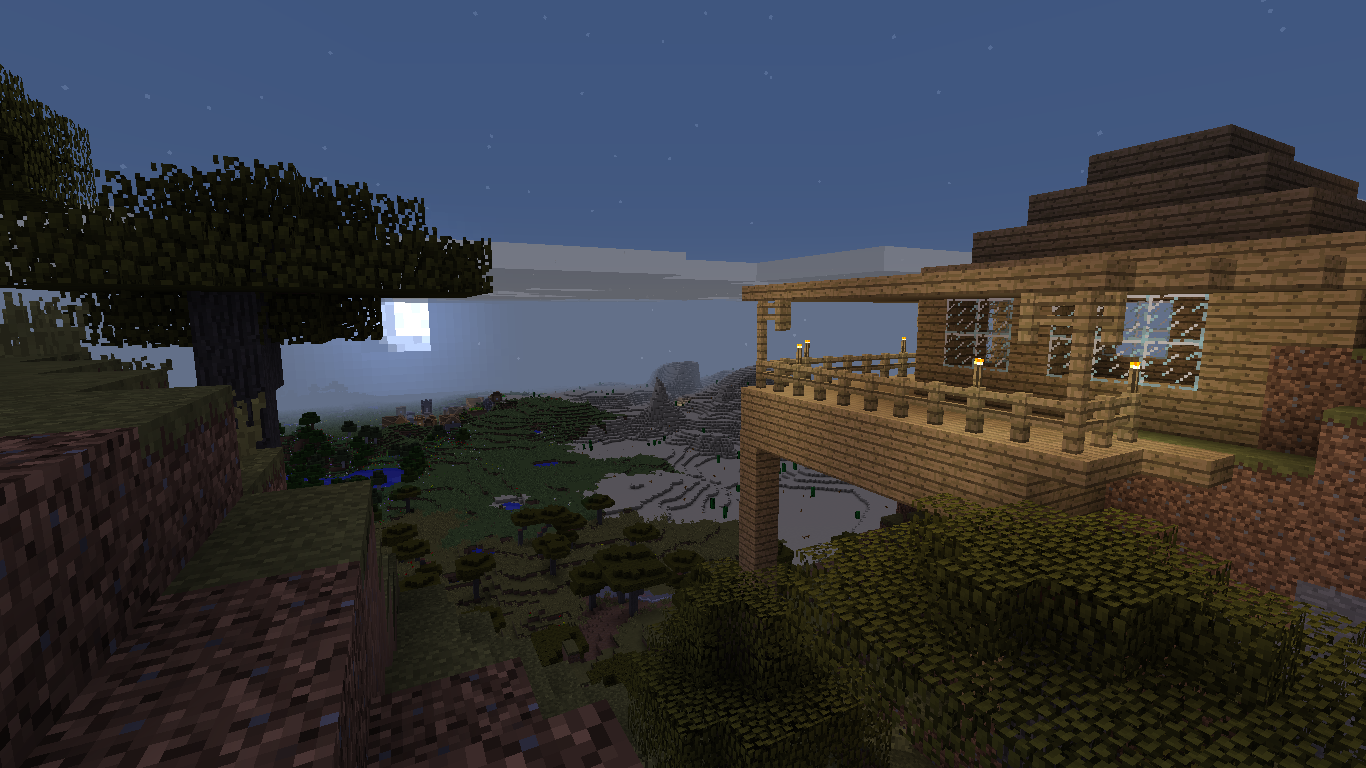
For example, without the abundant resources its community provides, Minecraft can be a daunting game for new players. Imagine playing it during its alpha phase: no extensive wiki, no idea how crafting works, no warnings about the dangers of the world. While on one hand this grants the player an authentic, purely exploratory survival experience unadulterated by guidelines, it can also leave players clueless about the possible interactions they could have with their world.
Minecraft’s starting stage is an expansive open world with a variety of terrain, fauna, and flora. The playground of the world imbues the player with a sense of adventure and wonder and sets the atmosphere for them to start their new experience. But there’s that word, “start.” How does a player start without knowing any mechanics? Minecraft’s gameplay is contingent on interacting with blocks in the world, but the game does little to explain to the player to go up to a piece of environment and hit it repeatedly until a reaction occurs. Through repeated experimentation and trial and error, a player might finally discover how to craft their first tools. However, it’s a steep curve from hitting a block to being able to imagine, “I want to build my next house on top of that mountain.”
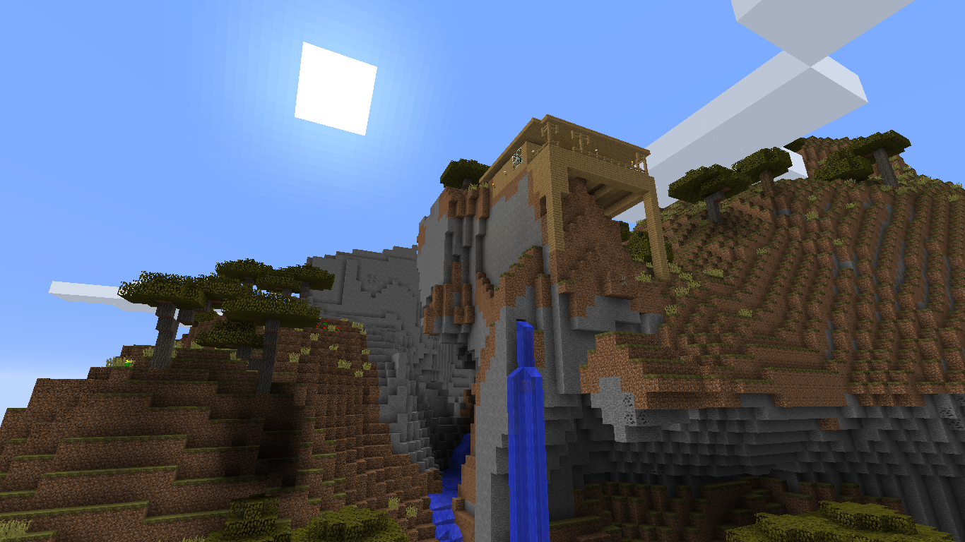 In expansive and sandbox-esque worlds, it can be difficult for designers to predict what a player might do. Having a world that is entirely experimental could actually backfire on the developers and lead to players choosing a more defensive playstyle. If the possibility of hindrances and negative effects exists behind experimentation, then logically a player might stop experimenting once they reach a point in the game where they can play comfortably. Allowing a little bit of an explanation and guidance can help the player feel a touch more safe about playing experimentally and continuing to discover.
It’s a challenge to guide the player through a game with mechanics and techniques so vast and experimental, which perhaps makes it easier to just give the player a few tools and let them experience on their own. Providing just the smallest inklings of information—hints at how to proceed forward—can be enough to ignite the player’s imagination and curiosity to delve deeper into a game and its mechanics.
At the same time, the presentation of information affects how well players absorb knowledge. Assassin’s Creed 3, in an attempt to walk the line between completely lacking a tutorial and telling the player how to play, mixes guidance with visuals. The amount of information provided as well as how it is presented to the player influences their experience. For example, cinematographic tutorial cutscenes and quicktime events that introduce mechanics can be a solution that combines light gameplay and tutorials in real time. But even this pairing of tutorials with aesthetics can fall short by not allowing a player to thoroughly flex their new skills and techniques through application and interaction.
One of Assassin’s Creed 3’s main selling points and hyped features was its vast, open frontier, available for players to explore, hunt, and scavenge through. The player was finally given access to this frontier after a few hours via a weapon tutorial placed between cinematic cutscenes. After trying out the new controls and weapons, the player is led through a short skirmish before being quickly whisked into another cutscene. Through forced, lengthy tutorials paired with beautiful cinematography, the player sees the full freedom of the game, but also feels it slip away as they are led to the next story objective.
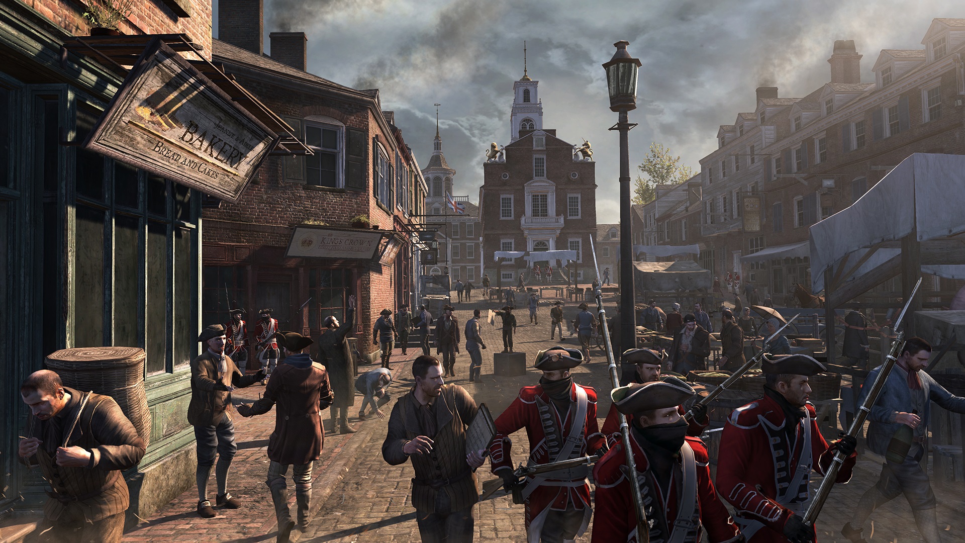 While it does blend gameplay and guidance, games like Assassin’s Creed 3 would benefit from giving the player some time to practice and settle into new mechanics and techniques. Quickly moving from one set of directions and controls to cinematics to more new controls gives little time to absorb, process, and understand new information. People often learn more efficiently when they are given the chance to toy with a mechanic or feature for themselves. When each bit of information can change gameplay, strategy, and experience, it’s important to take the time to come to terms with and integrate new tutorials.
Being engaged, interacting, and applying new information can lead to experimentation, which can allow for more memorable experiences. Figuring out new things by yourself makes the discoveries more personal—you figured out that technique, combo, or mechanic. Games that take the player on a long journey of button-mashing to skip through tutorials miss out on the opportunity to allow the player to create more connections with the medium.
While combining tutorials with cutscenes is an approach to integrating a kind of instruction manual into the game, it doesn’t necessarily integrate well into gameplay. It’s important to let the play settle in and digest tutorials. Allowing for experimentation leaves a more memorable tutorial experience, personalizing learning and discovery. Without such freedoms, it’s easy to lose a game’s aspect of play, and instead make games purely mechanical.
Tutorializing through level design also becomes a way to subtly hint the next objective and reveal mechanics to players. An aspect of design that transforms players into participants, as in Portal. A bright red button seems important when it’s just out of reach in the next room over, encouraging you to find a way to reach it. The most logical approach would be a door, but ticking timers tend to be a bad thing and the one on the wall is just about at zer-
Two holes—likely the titular portals—swiftly burst open: one in your room and one on the wall just beyond your glass box. Strangely enough, it looks like you can step into one portal and come out through the other. Wait, is that you in the glass box? Why’re you wearing an orange jumpsuit? The pulled back hair is a good touch, though. Hm, you don’t look so bad.
It seems portals are also for checking yourself out.
Mahreen Fatima embodies creative chaos as a designer, artist, and writer. Starting with a controller, she spiraled out of control into a life of writing opinions, painting digitally, and making games. Her musings can be found on Twitter and her work on her website.