Horror as Resource Constraint
Owen Vince examines the production of horror in experimental freeware games.
Seemingly “simple” games can pose big questions; they can horrify and unsettle us with very limited means, even without narrative, without context. The terror of finding yourself in a dark landscape with no explanation why.
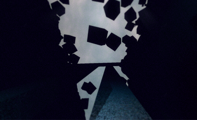
These were my thoughts on closing down developer Connor Sherlock’s Sanctuary. This is a game that lasts little over ten minutes, in which you wander a brittle, violent dark night and watch a sea of chafing, square orbs rise and fall in the sky. Your “sanctuary” is a large, Church-like structure in the middle of the game’s landscape. Waiting for the game to load up, I thought about “simple” games, and about the constraints they impose on their own creation. From a building design perspective, limited resources can give rise to the maxim that ‘form follows function’. But what, I wondered, if the function of video game development influenced its form? How do the limitations imposed by independent development, particularly for single-developer projects using tools such as Unity, influence game design? Do the limited tools, resources, and processing power available to independent developers bias them toward pursuing a particular kind of game over others?
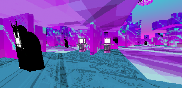
Recently, I’ve seen, downloaded, and played a lot of horror-style exploration games through platforms such as itch.io and GameJolt. I find them interesting, if uneven in terms of their quality. However, the best of them stick in your mind for a good long time; Tonight you Die, Sanctuary, Sigil Valley. There are a lot of games like these; games where you are invited, with minimal explication or narrative, to explore a simple, oppressive environment that is either cellular (lots of small, adjacent rooms) or geometrically landscaped (a big, continuous landscape requiring minimal processing and textures). Some of these are unmediated by narrative – you are simply exploring an atmosphere. Others are making a point; Error City Tourist is about alienation and the city. Tonight you Die is about suicide and the way in which space, specifically concentrated urban development, can shape our psyche and emotional responses to those spaces.
On Unity, on a budget, on your own or in small teams, there are obvious constraints imposed on the development. I don’t want to project too much on this; obviously, independent developers are each different. But I think that there exists some consensus around the idea that, with these limitations in mind, you can only do so much, particularly in – for example – a game jam scenario. But you can create tension, atmosphere, and aesthetic by making the most of those limited constraints. Big effects within small means.
I wondered why so many developers on this platform, and others, have pursued exploration games. Why are so many of these games, to a greater or lesser degree, “horror” games? Games about anxiety; those which are disturbing, upsetting, that create environments of ambivalence? Perhaps it comes down to our cultural fascination with dystopia. For every utopian imagination of a perfect city (such as Paul Scheerbart’s glass utopia, or Bruno Taut’s 1917 illustrations for a radiant city in alpine architektur), there are one hundred doomsday scenarios of degraded or abandoned cities, fascist states, and cities of surveillance.
‘Horror’ is a state of experience. But it is also a technology of spaces. Small, dark rooms are more generically ‘unnerving’ than wide, lush and naturalistic gardens. We are afraid of what might be hidden. Smooth, undulating surfaces are less horrifying than rough, granular, or angular surfaces and edges. Shadows are more horrifying than sunlight. And when I say ‘horrifying’, I mean it broadly; I mean that they can foster in us a negative or ambivalent reaction. Developing with minimal resources and time through Unity means that it’s often better to pursue ‘roughness’ and shadow, tight spaces and repetitive textures, than to generate more complex and ‘realistic’ environments. It’s more likely that sounds will be less smoothly mixed, and so more jarring. But this works to excellent effect in Kitty Horrorshow’s Dust City, where the screaming and grating of the sigils, when you activate them, literally cause you to baulk. The mechanics of their integration and activation within the game are, literally, “horrifying”.
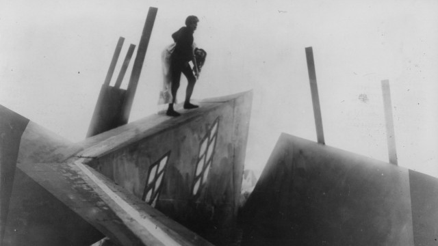
The work and resources required to create rich, naturalistic textures and environments can be enormous. The most naturalistic environments are a product of a team of developers working for months and with a budget of millions of dollars. Obviously, this isn’t a negative critique of independent or altgames developers, as if ‘complex’ or ‘more real’ environments are better than simpler or repetitive ones. Indeed, “altgames” have come to represent a sort of catch-all category to describe those games which don’t “hew to traditional aesthetics or mechanics” [link]. I don’t play simpler and more abstract games in order to punish myself. I play them to experience a game that does not compromise its design, thematics, or effects simply to broaden its appeal. These are games that are explicitly ‘avant-garde’, cutting edge, which break new ground just as the German Expressionist-horror film, The Cabinet of Dr. Caligari, broke new ground in 1920 by pursuing an artistically daring set design while playing unstably with perspective and perception. Within the as-then new industry of cinema, Dr. Caligari – like Sanctuary – worked against the grain, pursuing a distinct artistic and mechanical voice against commercial sensibilities and expectations.
My argument is that the particular resource and programming constraints of minimalist game design, like the itch.io freeware, lean toward the pursuing of an aesthetic and ludic strategy which prioritises an alternative horror game. One in which the atmospheric exploration of tight spaces, glitch aesthetics, depopulated cities, and reduced visual horizons are prioritised over the game elements more commonly found in larger productions (such as a large, interactive NPC population, etc).
Put another way, faced with less time, less processing power, and more limited resources, the designer creates a game that must necessarily be smaller. In order to have the most significant emotional effect, designers make the most of those constraints by articulating the fundamentals of horror which, as it happens, are aligned perfectly with these minimalist constraints; small spaces, mazes, rough edges, and textures.
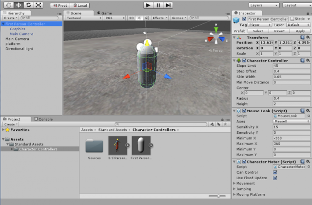
In fact, a large number of these alt-horror games are developed using Unity. This software enables the designer to “preview as they go”, by the “visible pieces of a game can be put together with a graphical preview and using a controlled ‘play it’ function”. You could argue that an explorative game-style is prioritised by the fact that the development toolkit (Unity) encourages the designer to drop in and out of the game during its creation. They can continuously, seamlessly, render and enter that game in order to ‘explore it’. Formally, the development software seems to encourage a mindset in which the designer is aware of the game as a form of exploration rather than as an abstract set of codes and behaviors which they code from a distance and only experience, as a whole, when the game is rendered.
But surely, there are other influences at work? The cultural imaginary of horror is made up of a mash of seemingly universal, evolutionary elements (the fear of shadow, a distaste for tight spaces, a tyrophophylic anxiety for decayed, pitted surfaces) and cultural constructs; the haunted house, the flickering lamp in an abandoned street, the disfigurement of bodies. Sanctuary plays on the terror felt within fractured and incomprehensible environments, the manipulation of heights, abandoned giant structures, and darkened forests. Dust City employs diminishing horizons, grating, and dis-harmonic sound, and depopulation as a means to create an atmosphere of anxiety. These are both cultural and evolutionary products which suit the minimal rather than the grandiose, even when they are channeling Gothic design references. One particular section in Dust City uses a simple, black lake and red sky to instill in us a certain trepidation. The simple, tight spaces and repetitive textures of the first house in that “room” is quietly terrifying. Why? Because it is like a house, but also terribly far from being one. It is the uncanny valley we encounter when a thing is almost, but not quite, real enough.
These designers are responding creatively and intelligently both to the specific resource and equipment constraints imposed by small-scale, independent games development in Unity, and to the cultural imaginary of “horror” and of what horror is. I think it’s important to note that the mechanic on which these games are based – exploration – seems to be functionally, formally linked to its overall aesthetic, appearing to be interdependent.
This would help us to move beyond more limiting genre labels based on mechanics, as Lana Polansky has argued, because the sub-genre of “horror-exploration game” emerges out of both form and function; it is horrific because it is based on conventions and design references which express horrific reactions and experiences of play, but the experience is functionally linked to the fact that small-scale, independent development favors exploration as a “ludic device”.
By eschewing realism and naturalism in favour of visual and ludic disruption (say, the impenetrable surfaces and tempo of Error City Tourist) – in pursuing expressionism through a more confined set of tools than are otherwise available to big studio games developers, we end up with a sub-genre of “” alt games that is both a reflection of the conditions of its own production, as well as a critique laid against those conditions. Horror exploration games, however loosely defined, are both confined by and escape their limitations. Form follows function, but is also not strictly, mechanically produced by it. Horror is a resource constraint.
Owen is a poet, design critic, and editor of PYRAMID Editions. He tweets @abrightfar.


