Art Tickles: Minding the Strokes
Taylor Hidalgo often misses so much when he only observes the broad strokes.
There’s an old adage that always seems to apply when I think of beautiful games: “A picture is worth a thousand words.”
Imagining beautiful hills, rolling with the gentle whisper of grass, accompanied by the quiet soundtrack of life, it’s hard not to want to wax poetic, at least on some level. On the opposite end of the visual spectrum, picturing a city of sleek lines, stark colors and huge contrast ratios still creates a desire to indulge in soulful language. Seas of skyscrapers delivering crisp reds and oranges accenting of a sea of black windows, or lush green softness surrounded by fauna both evoke the sorts of feelings summarized by that adage.
These are visual tableaus that are, in their own rights, hauntingly beautiful. Their colors and designs settle in our minds, populating us with ceaseless memories of places we’ve been, things we’ve done, and emotions we’ve experienced. Memories are made up of these, and they linger in our minds long after the events themselves have passed.
For some games, the visual style of the game endures far longer than the fleeting memories of the gameplay itself. Games like these, I’ve always felt, are the backbone of the “are games art?” debate that occasionally makes its way into feature articles and web forums. They’re the pieces that not only establish themselves as visual journeys for players to experience, but also manage to radiate the joy of play while we experience them.
For some titles, like the upcoming Joylancer, the aesthetic style can be a large part of the experience, bringing with it nostalgia and an entire history associated memories. The stage design, chiptune soundtrack, and sprite design all reflect a part of that experience. For others, like And Yet It Moves, the aesthetic is one that builds in-game atmosphere, helping establish a parallel between art design and game mechanic. Each of these is equally artistic, but they result in very different ways.
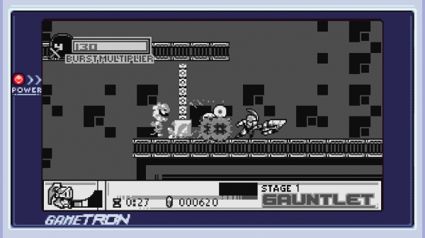
Joylancer is a tribute to classic handheld gaming, honoring the sharp sounds, brisk action, and frantic gameplay of a generation of gaming that’s since passed. Aside from just the surface trappings, though, dwells a deeper connection. The game itself plays to the greatest strengths of titles from that time. Individual actions are natural and ergonomic, major gameplay features and strategies emerge quickly and simply from play. This is an aesthetic by design, one that is experienced more powerfully from being played than by being captured. Onlookers would be largely unable to draw the same appreciation from screenshots or gameplay footage. To experience such a game without playing it is missing an entire dimension of its depth.
The aesthetic informs the player as much about how to play as an included read-me or the controls screen in the settings. Lifelong gamers will have unconscious memory of inputs and reactions already in place. In practice, everything is done in service of play. Every menu, character, and moment is all leading to the play experience. Nothing else exists that could hinder that. The very core of these aspects are buried in the grand aesthetic, giving a dimension of life that only a video game could convey. A depth of life unique to interactivity, simply by building on the shoulders of its predecessors.
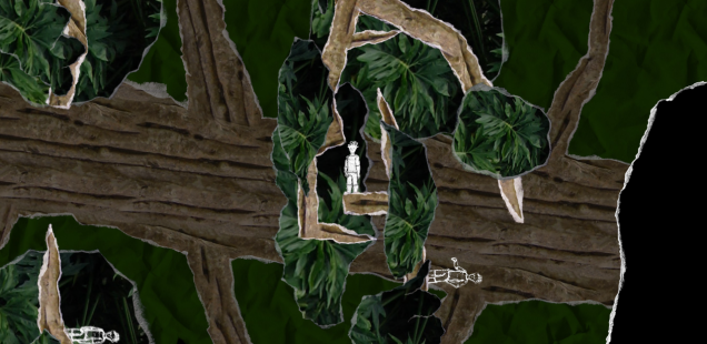
Similarly is the case with And Yet It Moves, a game whose cut-out aesthetic, abstract platforming, and singular design principle define so much more about the game than the puzzle platforming mechanics could. The game is built in service of the overall aesthetic, each game behavior informing the strengths of the world design and visual storytelling. Were it not for the challenging platforming aspects, it could be said that the title is simply an interactive experience, a place to fill the player’s mind with enchanting visuals and lingering soundscapes. However, the player’s input makes the aesthetic design that much more concrete, despite the flimsy-seeming nature of the papercraft, locking its player into personal and intuitive understanding of a world that is so foreign and alien.
Designs like these thrive in such an environment because they embody more familiar aspects of art, yet still retain a distance that can’t quite be bridged from stills alone. Their forms, shapes, and challenges are as much a part of the experience as the visual design, sound cues, or art direction. Without that aspect of play, something irretrievable would be lost.
For titles like these two, it’s natural to see the aesthetic as a comfortable extension of the gaming art form. Even something as simple as referencing a former aesthetic can have powerful results in players’ and onlookers’ minds. To bury textures and emotions into the visuals is likewise something that wouldn’t have the same effect without the player’s personal input, both from an observational and a participatory angle. These are methods that would be so much less enduring, and appealing, in less interactive media. As such, it is genuinely rewarding to see games that can so ably handle the biggest strengths of games’ unique aspects as an art form.
It would benefit us to occasionally reflect on these aspects, and others, in celebrating gaming as a whole. The equivalent to minding a master painter’s brush strokes, I suppose, in order to appreciate the finer details in addition to the grand successes. These visuals, soundscapes, and play experiences inform the thousands of words we say pictures deserve, and they do so with a dimension and depth I feel we sometimes miss.
After all, if a picture is worth a thousand words, what more is a beautiful game worth?
Taylor Hidalgo is a writer by hobby, grasping at the edges of professional work. He’s a fan of the sound of language, the sounds of games and the sound of deadlines looming nearby. He sometimes says things on Twitter and his blog.
A copy of Joylancer was provided by its developer Alpha Six Productions via itch.io’s Press system.

